For those of you who didn't make it to see my work at the degree show, here's a short movie that walks you into the show to see my space!
Wednesday 9 June 2010
Thursday 20 May 2010
Degree show details!
Come and see me and my final year work here:
F Block B3 & B4
Hanbury Street
Old Truman Brewery
91 Brick Lane
London E1 6QL
Friday 4th June - Monday 7th June, 10am-7pm every day
Click on the links below to find details of the Goldsmiths Degree Show 'Curious' - which is part of Free Range:
Free Range details and address
If you would like to attend the private view on Thursday 3rd June, please email me with your address so that I can send you an invitation.
Wednesday 12 May 2010
Nub experiment 1
nub experiment from Rachel Cockburn on Vimeo.
I spent yesterday working on this - the first 14 seconds of a nub to explain my project. Today, I was working all day on my presentation for the assessment - the first rehearsal is on Friday, and I want to be as ready as possible so that I can get some good feedback.Tuesday 11 May 2010
Monday 10 May 2010
Friday 7 May 2010
Scenario film process
Video process 1: Teacher workshop scenario from Rachel Cockburn on Vimeo.
Lastnight I took more photos to make a scenario film. I've been working on these today in Premiere - above is a completely unfinished version of the video - so you can see the process. It shows a user logging in to eat right, submitting a recipe, choosing to teach it, then receiving a phonecall from a member of eat right staff. The next scene shows her sharing the recipe with two members of her local community.
Yesterday I had a brilliant visit to see Loop.pH, who I worked for last summer. They gave me helpful advice about the presentation of my project that I intend to act on soon. I left the studio feeling very inspired! Thank you!
Tuesday 4 May 2010
Mapped local shopping list
I spent this morning preparing for my assessment, and then making a plan to help me get at least two scenario films finished by 11th May. Then I started working on the printable shopping list and local map that would be accessible from the meal plan section of the website. This is used in the scenario film - the user prints out the map & list, then takes it with them as they shop.
 I started by making the orange colour paler, so the map was more printer-friendly.
 Then I highlighted the recommended route. I spent ages making 29 images showing a figure moving around the route - but then I realised that I needed to do this once the whole printout was made - see below!
 Once I had completed the printer-friendly map & shopping list, I gradually built up a sequence of over 60 images, which will be used in the scenario film to show a user doing their shopping locally to fit their personalised meal plan.


I also made some refinements to the real-life photo sequences of a user going into each shop on the route, so they are now ready to turn into a film. This work also becomes part of the website.
Monday 3 May 2010
Refinement & missing pages
 Between the image above and the one below, I have changed the 'more people' buttons, handwritten the recipe names, and highlighted the current section of the website. These seems like tiny changes, but they make a massive difference.
 I've also refined the text for some areas of the website. Below you can see I've made slider bars for some pages.
 Over the last couple of days I have also been creating new pages that were missing before, like the one below. This takes longer than I anticipated - even though I have already decided on a general colour scheme and layout, new content means having to re-think the whole page again.
 I have also had to extend the map I had already designed, to include a farmer's market and a community allotment.
 This web work is frustrating - I have already designed over 40 separate pages, and spent two days more than I planned to on this.
 I need to get on with other parts of the project, so I'm going to spend Tuesday, Thursday and Friday working on the scenario films that I need to complete - showing how the cooking workshop would work. On Thursday I have another tutorial, so I'll use that time to make a plan for what I can realistically complete for assessment. It is really hard at this point to stand back and look at what I've done, to work out if it has the intended effect!
Friday 30 April 2010
further web development / refinement
 Had a tutorial with my mentor Belinda today - the first in five weeks - and it went well. There are some more refinements and alterations to make to the website, which I hope to complete in two days. I feel a lot happier with the overall look of the website now. Next week I'll be finishing at least two scenario films, and working on an online presence for the whole project.
Wednesday 28 April 2010
Catalogue photography & new london train line
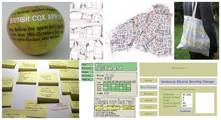
 For the degree show catalogue, I need to submit an image that represents my project. The obvious one would be the home page of my website, and I might well choose that one. However, we are using degree show funds to pay for a professional photographer (Tomas Valenzuela Blejer) to take a photograph for everyone, so I didn't want to waste the opportunity to get a good photograph. I spent a few hours brainstorming ideas and came up with this image - above. It would be great to know if you think it represents my project?
 Also today, I travelled on the newly opened Overground line today (the old East London underground line, extended) - and wanted to put a couple of photos on here! It was exciting as it only opened yesterday, it was very empty and clean, it travels through brand new stations - like Haggerston, above - and there were lots of people taking photos of it at each station. This has been a massive project, with buildings knocked down, new bridges put up, new stations built - since 2007. So it is nice to see the project right the way through like this.
Also, it gets me to uni in 45min for £1.80, instead of 1hr 30min!

Wednesday 21 April 2010
returning to web work
 After leaving this part of the project for a couple of weeks, I have really enjoyed coming back to it the past few days. I haven't received any feedback from my mentor yet, but I have some good constructive stuff from a couple of friends, so I used that as a starting point. I also looked at the elements of the pdf that I wasn't happy with previously.
 As you can see, I have changed the header banner - I feel that it is significantly better than the previous one. I also tried putting the menu buttons at the top of the page layout - Although this does give me more space to play with, I think that I prefer the original layout.
 Below, you can see I've added a hand written tag line to the 'eat right' title. Not 100% sure on the final wording of this yet, but I like the way it looks with the page.
 Above you can see that I've also been putting the data I've collected into each page. Click on the picture to enlarge it.
 I've been using a brilliant site called walkit.com to work out the best route around all the shops, the distance, time, etc - as well as how long it would take to walk to the different restaurants above. As well as telling you the distance between two places in London (in miles, km and steps) and the best route between them, it also works out how long it would take to walk, how many calories you would burn, and how much carbon you've saved by walking!
 Finally, above you can see the map I've created. Using the traced map of N1 that I created in February, I've made a map of the local area around me, and the route that would take me to all the local shops I need for the meal plan. This took ages but I'm quite pleased with the way it looks. I want to avoid using google maps for the website.
Friday 16 April 2010
Real food images and data collection


Since my last post, I have planned 3 days worth of seasonal, ethical, healthy, March meals (10 meals). I've bought the ingredients in local shops as much as possible, and mapped and photographed these shops. And then I've put my rusty maths skills to use, working out how much each meal costs per portion, nutritional information, etc. I've also made each meal, timed it, written out my own versions of the recipes, and tried to take good photographs of each one. I originally only allowed 2 days for data collection in my timetable - which is unrealistic. Luckily, it has been fairly simple to compile the data at the same time as working on the other elements of the project.


While collecting data, I've been working on the scenario films, and have been getting feedback on the website work that I did, ready to improve it next week. The films haven't gone to plan but I have allowed time for that so it shouldn't matter too much. I have planned two scenario films entirely - working out the sequences of photographs I need, etc - and a possible third. I came up with another 3 or 4 scenarios which would require additional data collection / real workshop scenes.
I've taken the photographs required for a couple of the sequences, however when working on them yesterday I realised that I need to have the finished pdf of my website in the background of each. It would be mad to go through all 80 or more images for each scene and replace the computer screen using photoshop! So I need to re-shoot these sequences once the web work is complete. I have got to grips with the basics of Premiere now, so it shouldn't take too much time to turn the photos into a film, once I have the right images.
For other scenes, I need to have the real data - i.e. a route around all the shops, on foot - which I have only just worked out! So both elements of the project have been more complicated than I planned for. Tomorrow I'll be taking more photographs for the scenario films.
Wednesday 7 April 2010
first pdf completed & saatchi
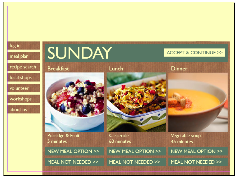
 Yesterday I finally completed the pdf file showing every page of the website. It still needs more work doing to it - lots more - but I'm going to come back to it in a couple of weeks to improve it.
I've put some images here of a few of the pages.
I got some really helpful feedback on it from a friend, and I've sent it to my mentor to look over, but it would be great to get feedback from you as well - anything you think of, about the layout, the colours, the usability of it, etc.


 Now what I'm doing is collecting and creating the real data and images needed. Most of the images in the pdf are from online sources and the text is mostly made up or guessed. So I need to sort that out now. I've written a list of all the data needed and how to get it - so now I am in the process of doing that.
I forgot to mention here that last week I went to see Richard Wilson's 20:50 at the Saatchi gallery. I've wanted to see this exhibition for years - since long before I lived in London - so I was excited to see that it would be returning to London again. It is in the basement of the gallery. The installation is basically a room filled with oil, with a path cut out into the centre. The reflection looks so realistic that my boyfriend (who had a cold and couldn't smell the oil!) thought it was just a room, and couldn't understand what I was looking at. I have to say that from photographs, I think it worked better when the Saatchi gallery was in City Hall - because the wooden panelled walls and windows were more interesting - but it was still a great experience to finally see it in public.

Saturday 3 April 2010
aesthetic development and research
 I got some feedback about the designs I came up with on tuesday, and since then, I have been developing them further, and started to make up the files and layouts for each page. The designs I did on Tuesday were in Photoshop - so I started by translating these to inDesign. I also scanned in some brown paper of my own - until now I have been using an image from the internet.
 As you can see above, I'm still using 'fake' data and images at the moment - but as soon as I finish all the layouts, I'll be collecting the minimum real data required to demonstrate the website believably.
I tried different colour and outline combinations to start with.

 After I had done this (the process shown above took a whole day), I did some research. The working title I've chosen for the website is 'eat right'. I'm not 100% comfortable with this - as it implies that to eat any other way would be wrong - and that is not the point of the website. But it is the name that I am most happy with so far - and it is simple and short. I found a couple of online sites already using this name - see below.
 The Guardian's eat right is interesting because it hadn't come up in any of my project research so far - confusingly, because it provides meal planning services and dieting help. As this is so mainstream it probably means that I wouldn't be able to use the name 'eat right' in the real world.
 This American website also uses the name. I'm not concerned with this right now though - I'm back to focusing on the website. Today I continued to develop the aesthetic, mixing what I already had with hand-drawn outlines.
 I also spent some time buying suitable fruit & veg (oranges, courgettes, limes, cucumber, nectarine, and avocado - all of which made me feel guilty as they were from tesco and not in season!), carving letters into them, and photographing them to create the web page header.
 The header made the existing teal colour look very dull, so I sampled colours from the header and tried using them in the rest of the page. I also changed the hand-drawn element, as I thought the black was an extra, unnecessary colour.
 Above is the image of where I'm at now. I'm much happier with the body of the page (although not 100% sure on the hand-written buttons), but need to work more on the header. I want to try using a computer-generated font for the outlines, and just photos of the food surfaces, not carved in. I could also try cutting the letters from any food. And I could try hand-drawn outlines.
Tomorrow, I want to work more on the layout of each page - I haven't actually counted how many pages there are to lay out yet, but I'll try to sort the layout for all of them. It would probably be sensible to do that with a master page, so that when I come to change the header or colours, I can do it in one go.
I still intend to meet the deadline I set, for sending a finished pdf of the entire site to Belinda (my mentor) by the end of tomorrow, to get her feedback. However, the pdf isn't going to be finished to the standard I'd hoped - it is a slow process.
Subscribe to:
Posts (Atom)