
 I got some feedback about the designs I came up with on tuesday, and since then, I have been developing them further, and started to make up the files and layouts for each page. The designs I did on Tuesday were in Photoshop - so I started by translating these to inDesign. I also scanned in some brown paper of my own - until now I have been using an image from the internet.
 As you can see above, I'm still using 'fake' data and images at the moment - but as soon as I finish all the layouts, I'll be collecting the minimum real data required to demonstrate the website believably.
I tried different colour and outline combinations to start with.

 After I had done this (the process shown above took a whole day), I did some research. The working title I've chosen for the website is 'eat right'. I'm not 100% comfortable with this - as it implies that to eat any other way would be wrong - and that is not the point of the website. But it is the name that I am most happy with so far - and it is simple and short. I found a couple of online sites already using this name - see below.
 The Guardian's eat right is interesting because it hadn't come up in any of my project research so far - confusingly, because it provides meal planning services and dieting help. As this is so mainstream it probably means that I wouldn't be able to use the name 'eat right' in the real world.
 This American website also uses the name. I'm not concerned with this right now though - I'm back to focusing on the website. Today I continued to develop the aesthetic, mixing what I already had with hand-drawn outlines.
 I also spent some time buying suitable fruit & veg (oranges, courgettes, limes, cucumber, nectarine, and avocado - all of which made me feel guilty as they were from tesco and not in season!), carving letters into them, and photographing them to create the web page header.
 The header made the existing teal colour look very dull, so I sampled colours from the header and tried using them in the rest of the page. I also changed the hand-drawn element, as I thought the black was an extra, unnecessary colour.
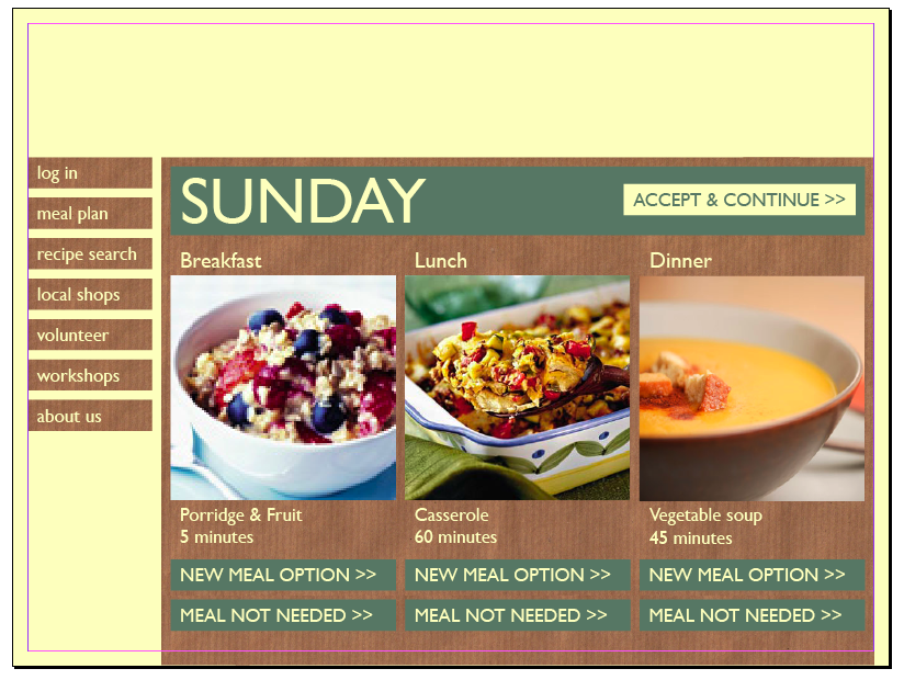
 Above is the image of where I'm at now. I'm much happier with the body of the page (although not 100% sure on the hand-written buttons), but need to work more on the header. I want to try using a computer-generated font for the outlines, and just photos of the food surfaces, not carved in. I could also try cutting the letters from any food. And I could try hand-drawn outlines.
Tomorrow, I want to work more on the layout of each page - I haven't actually counted how many pages there are to lay out yet, but I'll try to sort the layout for all of them. It would probably be sensible to do that with a master page, so that when I come to change the header or colours, I can do it in one go.
I still intend to meet the deadline I set, for sending a finished pdf of the entire site to Belinda (my mentor) by the end of tomorrow, to get her feedback. However, the pdf isn't going to be finished to the standard I'd hoped - it is a slow process.
No comments:
Post a Comment